
This is part of the Total Usability Series that was originally published in 2007. A decade later, usability is more important than ever, so we are revisiting this series and updating all of the articles. This post was updated 12/7/2017.
Since the “purchase” is the ultimate conversion, it’s imperative that you remove as many obstacles from the customer’s research-to-buy cycle as possible. The easier it is to shop and buy, the more customers will overcome the natural hesitations that many feel before they hitting the final “complete order” button.
Provide these 11 key ecommerce usability elements to create a smooth and worry-free shopping experience.
1. Search functionality
If possible, create an extremely robust and accurate search function for the website. A good search function should be able to provide visitors the information they are seeking even if products are misspelled in the search box or search products are not offered at all. Be careful, as anything less than a perfect search function only serves to frustrate rather than help visitors. Here are some best-practices to ensure your on-site search is effective.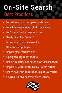
2. Navigation paths
Create clear navigation paths from the moment a product is added to the shopping cart. This path should allow them to continue shopping, continue with the purchase process, or get additional questions answered as needed.
On this site, you can easily continue shopping or go straight to the checkout: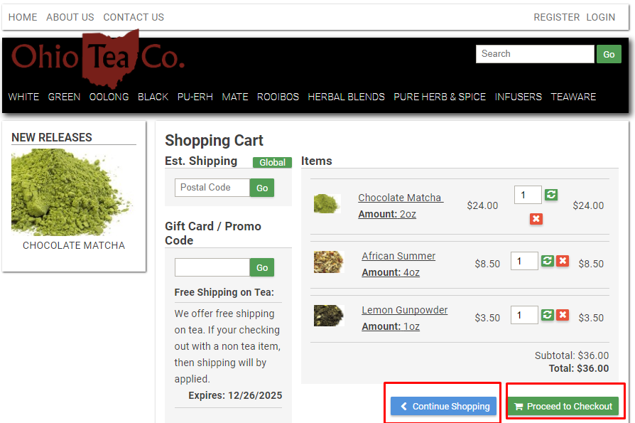
3. Calls-to-action
Informational and product pages must consistently use clear calls to action encouraging shoppers to buy now, save for later, or post a review. This not only gives your visitors options but compels them to continue moving forward in the process.
4. Product presentation
Present your products in a way that allows the visitors to quickly glean the information they need. Use clean images, allowing multiple views and image enlargements to give the visitor a complete view of the product they are purchasing. If you can provide videos of the product “in action,” even better.
5. Product availability
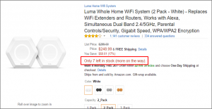
Listing product availability his a helpful signal that shoppers can purchase this product now and expect to receive it quickly. At the very least, be sure to tell your visitors if the product is out of stock or if they should expect any shipping delays due to availability. Amazon is known for showing stocking information on products on its site:
6. Product comparison guides
It is extremely helpful to allow shoppers to compare product features and benefits side-by-side. If you don’t sell multiple products then create a comparison between your product and your competitors’. Be honest. If your product lacks what a competitor’s has, document that appropriately.
7. Customer product reviews and ratings
If possible, allow your shoppers to post reviews on your product pages. Don’t discriminate by removing unfavorable reviews. These can be helpful and show that your reviews can be trusted and that you stand behind your products despite the occasional negative comment. Prominently display the average rating with stars or another visual representation in a prominent place.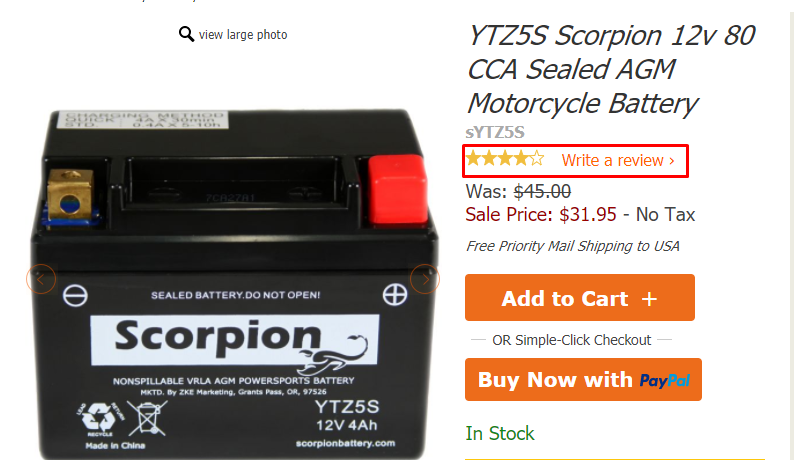
8. Up-sell / cross-sell
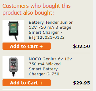
Be sure you are using your up- and cross-sell opportunities to the fullest potential. Provide a list of related products that typically go along with any current items in a shopping cart or product being viewed. You can also show similar products that have different features that might be more to the shoppers liking.
9. Add-ons
If applicable, allow shoppers to purchase additional services such as product engraving, customization, gift wrapping, etc. These features can make a nice up-sell opportunity while giving the visitors that customization offer that they need for special purchases.
10. Representative contact
Some shoppers want the comfort of knowing that they can call and get assistance with their order. They may even rather place their order over the phone. Meet your visitor’s needs by providing an easy to find 1-800 contact number along with other contact information. Bonus points for offering a live chat option.
11. Billing options
Provide your shoppers with multiple options on how to pay for their purchase. Some shoppers are more comfortable with one form of payment over another. Allowing their preferred option can be all it takes to get them to hit that “pay now” button.
Take Care of Your Most Valuable Asset
It’s not your products but your shoppers that are most valuable to you as a business. Most likely, the same products you sell can be found elsewhere and at a cheaper cost. This means you need to make sure your shoppers are treated accordingly. Ensuring that your site meets and exceeds shoppers needs and expectations provides a comfortable and trustworthy environment that will make shopping and buying easier. This, in turn, will improve your conversions selling more products at a smaller expense.
