
This is part of the Total Usability Series that was originally published in 2007. A decade later, usability is more important than ever, so we are revisiting this series and updating all of the articles. This post was updated 11/2/2017.
Your website’s privacy information and security settings can be significant hurdles when it comes to gaining trust with your visitors. Establishing trust is paramount to enticing visitors to make that final commitment, whether that be making a purchase, choosing to provide their info, or simply making initial contact with you.
Your job is to make sure your visitors feel confident that their information is kept safe and will not be used for nefarious purposes…or anything really other than what they expect that information to be used for. In addition to providing the assurances they need, these pages must function well and be user friendly to help support the message of trust they should convey.
12 Elements of Usable Privacy & Security Pages
Make sure your privacy and security pages have these elements to make them usable:
- Simple page structure. You should have specific pages developed that address both privacy and visitor security issues. These pages should be easy to access and structured in an easy-to-read fashion.
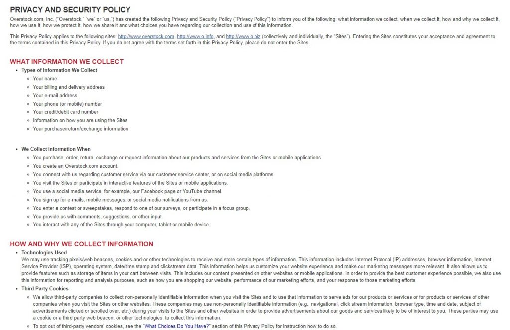
- Scanability. Be sure your privacy and security pages are easy to scan. Categorize information into sections so visitors can easily find information that is most important to them. Overstock utilizes section headings and bulleted lists to create a scannable privacy and security page.

- Section summaries. With each page divided into sections, each main section should start with a short summary or introduction that then leads to more specific points outlined in greater detail.
- Information types. Identify the different types of information that is collected from your visitors and explain how that information will be used. Be specific so visitors get a complete understanding of what happens to the personal info details they provide. Walgreen’s has a very detailed explanation of what information is collected, how it’s collected, and how it’s used on their site.
- Explanation of cookies. If cookies are used for the purpose of storing information, explain why and how long the cookie stays active on their computer.
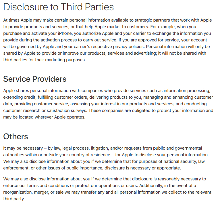
- Info sharing disclosure. Explain to your visitors if any information collected will be shared with other third parties and explain the circumstances and reasoning why, just as Apple does:

- Data protection statement. Explain how user’s data will be protected and kept safe once their information is collected. Note if any SSL encryption is used, and specifically how information on minors (if applicable) will be protected.
- Self-protection tips. As an additional benefit, it’s a good idea to provide further information on how your visitors can protect themselves and their information on the web in general.
- Properly located links. Footers are often the “expected” location of links to your privacy and security pages. If not already included, it’s best to find a permanent place in your footer for these links.

- Contextual / form links. Don’t let your footer be the only place for such links. Links to your privacy and security pages should be included in all appropriate locations, such as with forms, shopping cart, etc.
- Security images. If and where appropriate, use visual images to indicate to visitors they are viewing secure pages or sections of the site, or are entering information into a secure web form. These images give visual confirmation of security that helps establish additional layers of trust.
- Site links. The security and privacy pages are a good place to provide additional links to sections of the site that allow users to change preferences, contact info, opt out, etc.
When establishing trust and credibility, it’s often the littlest of things that can make the biggest difference. Shoppers simply want to feel comfortable about their purchase. The more small comforts you can provide them the more apt they will be to complete the shopping/purchase process.
