This guest post was written by Nicholas Cardot from sitesketch101.com.

Imagine with me for a moment that an individual decides to create a blog on the topic of becoming a complete and utter failure at whatever you attempt in life. After a few months, or perhaps a year, this blog becomes wildly popular. This failure blog has tens of thousands of readers, hundreds of thousands in revenue, and more social media fans and followers than can be counted. Was this blog a raging success or a monumental failure for not accomplishing the very thing it set out to teach?
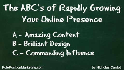
Although some in the world of art can get away with flinging paint at their canvas in random splotches, working toward success in the world of online business requires a bit more planning and work. Enter the three pillars, or the ABC’s, of online business: amazing content, brilliant design, and commanding influence. These principles provide a sweeping framework that will guide you as you plan and execute your online activities.
Of course, most of us don’t have to face this conundrum in our blogging experiences. It’s very likely that although most of you have goals that are separated from the goals of your peers, failing is not one of them. It may be your goal to create a second source of income, which ultimately allows you to break free from the nine-to-five grind. It may be your goal to create a community that provides a positive social experience and growth for everyone involved. It may be your goal to expand the effectiveness of your company’s online presence. It may be your goal to simply enjoy the sense of self-worth that comes from creating or writing something that others read and genuinely enjoy. Regardless of which driving force is fueling your online efforts, failure is likely not your end game.
Amazing Content
With full knowledge that I will sound trite for citing this overused cliché, I still find it necessary to use for the introduction of this topic: Content is King. Content is the foundation of any successful blog. Content is what provides the information for which your readers are searching. Content is what I refer to as the pavement on the information superhighway.
But if you paid attention to the title at the beginning of this section, you see that I don’t promote content, but rather amazing content. Amazing content is that which is easy and fun to read. It’s packed with properly researched information. It abides by the rules of grammar, avoids trite expressions and jargon, and is free of typos and misspellings. It’s sprinkled with humor and topped with a kiss of your personality.
To learn how to create great content for your blog, constantly read articles that teach you how to expand your writing skills. CopyBlogger is a stellar blog dedicated to content as it relates to marketing. Men With Pens is an amazing place to improve your writing, and they offer terrific writing courses. Write to Done is a stellar place to find inspiration and actionable tips for writing more effectively.
Brilliant Design
Now that you’ve worked to improve your ability to provide content that will dazzle your readers, it’s time to move forward. It’s time to wrap your content in a beautiful design package that multiplies the enjoyment of reading your material.
People are visually stimulated creatures, and regardless of how often we chastise the practice, people do judge books by their covers. Many people who visit a less-than-amazing-looking blog tend to leave before even looking at the first post titles. They judge you and your credibility by the visuals they’re presented with upon arrival and often make a decision to stay or go within seconds. Below are a few concepts that you should keep in mind as you work to improve the appearance and layout of your website.
Usability: Usability is the measure of how easy it is for your users to navigate your site, locate information, and interact with you or your content. Improve your site’s usability by simplifying the layout of your site, by providing clear, easy-to-find navigation links, by uncluttering your sidebar, by using fonts and font sizes that are easy on the eyes, and by placing popular tools (i.e. RSS feeds or Twitter links) in clearly-marked, highly visible areas of the page.
Direction: Direction refers to the pattern that a user’s eyes follow when they first load a page on your website. Although there are certainly natural patterns that people instinctively follow (i.e. the F-pattern), you can influence these patterns with proper visual cues. A few common variables that you can adjust to guide your viewers include font size, font color, images, image placement, white space, implied lines, or even animation.
Surveys: Find a person who has never seen your site before. Sit them down at a computer in front of you and ask them to browse your website. Observe quietly. Offer no help. After they’re done, ask them a few questions to get their thoughts on the experience. Do not rebut anything that they suggest or complain about. Do not get defensive. Instead, write their complaints on a piece of paper and devote some time to ensuring that future users don’t face the same issues.
These are only a few of concepts at the core of creating a brilliant design. Hopefully they provide you with an increased awareness as to the importance of providing your visitors with a positive visual experience. Take control of your website’s theme and create a first and lasting impression that will multiply the effectiveness of your content and keep your users coming back again and again. If you’re not web code savvy, search some popular theme clubs like Elegant Themes or Theme Forest. Take your time and browse as many themes as possible before selecting the look and feel that will represent you and your content to the online world…and then customize.
Commanding Influence
The phrase Information Superhighway is no longer the dominate term used to refer to the internet. It’s not because the internet isn’t loaded with massive amounts of information and data, but rather because people are increasingly using the internet for social connections and entertainment. Internet users are now drawn to genuine connections, not just valuable content. People are spending their time online no longer just for information, but now for the interaction.
As you work to take your online presence to the next level, you cannot ignore the human side of the internet. You can’t buy influence at your local Wal-Mart. You don’t find it lying around on the side of the street like a misplaced five dollar bill. It’s earned through daily hard work, interactions, honesty, and transparency. But once it is established, influence will likely be the most valuable weapon in your arsenal.
Although this includes the comment area on your website, this is also where social media comes into play. You multiply your efforts by taking the conversation where your community is already congregating, whether that be on Twitter, Facebook, Pinterest, Google+ or anywhere else. The important part is to remember that you’re using these mediums not as a catch-all for self-promotion, but rather to build relationships, grow your community, and establish your influence.
The Total Package
As you work to focus on these three things, don’t get caught up in trying to figure out which one is the most important for growing your online presence. The most important of these three is the principle of the total package. The individual who can find a way to maximize their strength in all three aspects will have a decided advantage over their peers who choose to only focus on one or two.
Author Bio: Nicholas Cardot is an avid blogger and passionate website developer. He loves connecting with real people and helping others to develop their online skills. He can be found writing at Site Sketch 101 or you can connect with him on Twitter at @Nicholas_Cardot.
