Originally published December 4, 2012, updated January 15, 2016
Whether you are optimizing your website for search engines or your site visitors, heading tags are an important aspect of your on-page optimization strategy. The overall pull of heading tags in regards to search engines is up for debate, but very few SEOs believe they hold no value at all. While they may not be the proverbial magic bullet for instantly improving your search engine rankings, optimizing heading tags for search engines are, at the very least, another baby step toward a more perfectly optimized web page.
What are Heading Tags and How Do You Use Them?
There are six heading tags you can use:
<h1>, <h2>, <h3>, <h4>, <h5> and <h6>
The numbers represent importance, with 1 being the most important and 6 being the least. While the hx code is hidden in the page source code with the rest of the HTML, the content of the tag is displayed on the page. Here is how an h2 tag appears HTML code:
<h2>Quality, Growth-oriented SEO Services that Get Results</h2>
Using Heading Tags As An Outline

The best way to illustrate how to use heading tags is to equate it to how you put together an outline of key points for any type of written document. Think of the h1 tag as the title of the page’s content. This doesn’t necessarily have to exactly mirror the page’s title tag, but since they are both representing the content, they should be pretty similar in overall meaning. While the title tag is limited in space, the h1 tag is only limited by how it appears and reads on the page. This gives you room to expand on the title tag using additional descriptive words and/or catchy hooks.
In almost all cases, you want to use only one h1 tag for each web page. There are limited exceptions such as when you have a news site or a blog. In these cases, you can use code to create sections of content giving each section its own h1 tag. But for general purposes, where each page of content is written on a single topic, one h1 tag per page is all you want. Don’t place your logo or business name (or any other global element) into an h1 tag. These represent the site as a whole, not the page’s specific content.
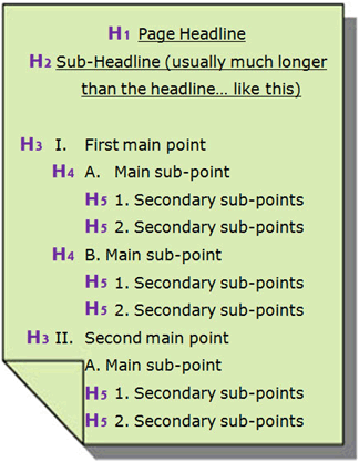
In a traditional outline, you have your main points I, II and III, each followed with sub-points A, B and C, which also might have their own sub points 1, 2 and 3, etc. Since hx tags are designed as level markers, not specific points, the h2 tag would represent your main points, h3 your sub-points and h4 your sub-sub points and so on.
Note: in the image example above, I have illustrated this with a slight variation. Some content uses a sub-title just below the title. In these cases Title is the h1, per usual, but the sub-title uses the h2. From there the main points start with h3, and then go progressively down from there.
Most web pages don’t need to use more than four heading tags (h1, h2, h3 and h4.) With longer content, you may use all six, but many pages need only an h1 and a couple of h2 tags. However, heading tag usage should always be dictated using the outline format and as determined by the needs of the content itself.
Many site developers use the hx tag to section off different navigation sections. If you do this, be sure only to use h5 and h6, leaving h1-4 exclusively for the content on the page. My vote is not to use headings outside of the page content at all, but you need to work that out with your developers.
How and Where Heading Tags Are Displayed
The font, size and color of headings will vary from site to site. In the image below, the orange text represents an h2 heading. The heading above is also an h2. Some sites just might make their headings look like nothing more than a bold text, however, good usability practice is to make them display differently than standard or bolded text.

It is recommended that your headings use larger fonts than standard-sized text, with h1 being the largest, h2 second largest and so on. You can also use colors to make your headings stand out, especially once you get down to the h5s and h6s, which might be the same size as the rest of the text.
How You Benefit From Good Headings
Proper heading usage can have both a visual and a search impact, either of which can help or hurt your site performance.
Improves Scannability
At the most basic level, headings help improve the ability of the reader to review, consume and digest your page content. Headings help visitors easily peruse and find the information that is most relevant to their particular need. Without the ability to skim, readers will be forced to read every word rather than being able to jump to content most relevant for their needs. Too much of that and readers are likely to jump ship.
Skimmable headings allow visitors to jump around the page looking for key points and context that helps them make a decision about what to do next.

Added Search Relevance
The search optimization impact of headings is arguable, but most SEOs agree that there is at least a minor impact. This means you want to use your headings–especially your h1 tag–to your greatest advantage. Inserting keywords into your headings gives both search engines and visitors additional context to better understand the subject of your content.
Keyword usage in your heading tags should be minimal and only inserted when it makes logical sense to the reader to do so. Don’t try to stuff your headings with keywords as that will only produce a negative impact on both the search engine and the visitor.
Contextual Hierarchy
When headings are used as indicated above, you give your content a proper hierarchical structure. Content hierarchy helps the visitor decide what’s more important to be read (sub-sub-points are less important than sub-points), in much the same way as newspaper articles start with the most important information first to allow the reader to abandon at any time without missing what they likely do not already know. While web page content may not be written in exactly the same manner, the headings give a good indicator as to what information is most relevant.
Both search engines and searchers use this to determine the overall value of content. For example, this particular section uses h3 tags. Anyone skimming this content could choose to skip the “Improves Scannability” sub-section (if that’s something they already understand,) in favor of the “Contextual Hierarchy” sub-section (if that’s something they want to understand better.) The better your page hierarchy, the easier the page will be read by both visitors and search engines.
How to Craft a Good Heading
There is no universal right or wrong way to write headings. Some are short (2-3 words), while others might be 5-10 word sentences. I prefer longer, sentence-like headings, as they help sell the content below it. The route you go is entirely up to you and the preferences of your audience.
Each heading should represent the content that immediately follows, creating a clear trail of tease-to-fulfillment as the reader moves down the page. Use headings to group content rather than giving each paragraph its own heading. Sometimes that is warranted, but usually not.
Newspapers and magazines are great at using paragraph headings throughout their stories to maintain reader interest. They use headings to both make content skimmable and highlight key areas of topical relevance.
Overall, when headings are used properly on the site, you’ll see reader interest and engagement improve. Your content will be more accessible to both the visitor and the search engines, and the end result should be greater visibility and conversions. You will not likely see a jump in search engine rankings just by adding or improving key headings, but you should have a more pleased audience to engage with.

3 Responses to The Complete Guide to Mastering Your Heading Tags