“That blog post has too much information.”
–No One, Ever
When it comes to content presentation, blogs have the advantage. The primary focus of a blog post is the content itself. Aside from making it interesting (both visually and intellectually), all you need for a good post is good content.
But the same can’t be true for other pages of your website, especially product category pages. On these pages, the primary focus is the products that you are trying to get visitors to view.
But the problem is, product lists don’t speak for themselves. Which means you need content to do the talking for them. Especially if you have any hope of getting your product category pages to rank for relevant keyword searches.
And that, my friends, requires a delicate balancing act: To have the content needed to sell visitor on your products without hurting the usability or the optimization of the page.
The Problem With Content
One of the problems with optimizing product category pages is where to put the content. The choices are:
- At the top of the page – where it pushes the products below the fold.
- At the bottom of the page – where it will never be seen or valued by search engines.
- On the side of the page – where it just looks weird.
Of these options, number one is the most attractive. You can easily get a paragraph of content above your products without pushing them too far down. Add a little formatting and your paragraph can feel like a natural part of the page and enhance the visitor experience.

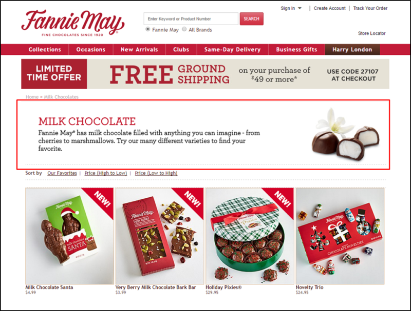
Fannie May’s website provides a good example of how you can provide short descriptions on product category pages without pushing products below the fold.
But what if you need more than a paragraph? If you can say everything that needs to be said about the products in that category, great! A paragraph will do just fine. But sometimes you need more. And more text above your products will push the products too far down the page.
This is where you can take a page out of the mobile usability playbook.
Content On Demand
Google has already stated that content hidden behind tabs, accordions or expandable text boxes won’t be devalued on mobile devices. As of right now, they are still devaluing such content on desktop devices. But for how long?
Content is hidden in such ways on mobile out of necessity. The screen real estate is just too limited. Hiding content allows visitors to have access to every bit of information on the page but on more of an on-demand basis.
But isn’t the same true for desktop?
While computer monitors give you more screen real estate, we still want to make sure we are providing visitors with a streamlined, uncluttered experience. Which often means that making content on demand — just like mobile –is the right solution.
I doubt that Google will continue to devalue such content on desktops for the long term. In my opinion, it’s just a matter of time before they treat it just like they do on mobile devices — if they aren’t already and just not admitting it.
Serve the Visitor First
But what if I’m wrong?
So what, I say!
The purpose of the content is for the visitor. If it needs to be there it needs to be there. If placing it behind an expandable “read more” link provides a better user experience, then I say do it. Serve the visitor first.
If Google chooses to devalue the hidden portion, so be it. Slightly devalued content that is available is still more valuable than no content at all. And truth be told, content hidden behind an expandable menu probably won’t have any less value than always visible content at the bottom of the page.
Checklist for Balancing Content With Usability
- Write your content.
- Write as much or as little is needed for each page.
- Included all information your visitors need.
- Determine the best way to display your content.
- Consider tabs, show/hide boxes, among other options.
- Implement it, and let Google worry about the rest.

 “The purpose of the content is for the visitor. If it needs to be there it needs to be there. If placing it behind an expandable “read more” link provides a better user experience, then I say do it. Serve the visitor first.” — Stoney deGeyter
2 Responses to How To Manage the Content Balancing Act on Product Category Pages