E-commerce is an industry that has boomed in popularity in the last decade. With more and more consumers looking to fill their needs online rather than going to brick-and-mortar stores, more e-commerce shops are cropping up all over the world.
Selling products and services online takes a much different approach than traditional business models. To generate leads and secure conversions, e-commerce sites must utilize the very best in user interface (UI) and user experience (UX) design trends. They must stand out from competing sites and secure customer loyalty. Here’s how to prepare your site for 2018’s e-commerce UI/UX design trends.
Optimize Delivery of Goods or Services
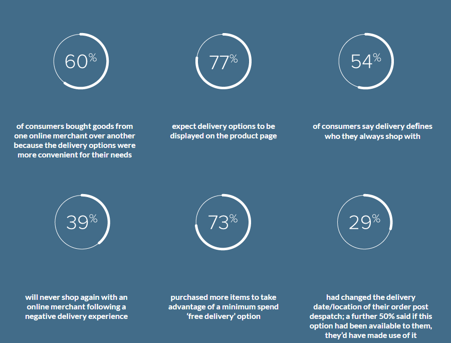
The most recent MetaPack consumer research report, 2017 State of E-Commerce Delivery, sheds light on a few harsh realities of modern e-commerce. One surprising statistic is that 39% of shoppers said they would never return to an online merchant following a negative delivery experience. That puts a great deal of pressure on e-commerce sites to get delivery right the first time.
Fast and free delivery options from e-commerce giants like Amazon.com have put smaller businesses in tough positions. Smaller online merchants may not be able to match the shipping prices of major competitors. Luckily, there are creative ways to improve delivery such as offering personalized shipping options. You don’t necessarily have to take a profit loss offering free shipping to make your site competitive. The MetaPack report stated that 35% of online shoppers prioritize convenience over cost. Offer options such as delivery date, time, and place personalization at an extra price to keep customers happy without affecting your profits.

Master Mobile UX
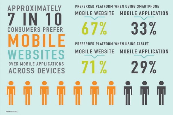
The statistics on mobile shopping are impressive. A study from the Nielsen Norman Group showed that 60% of online shoppers use their mobile devices to research a product before they buy. One internet research study found that mobile shopping drives about one-third of all e-commerce sales. In some markets, mobile shopping has experienced enormous growth in a short period of time. Some regions reported up to 250% growth in just two years’ time.

Currently, about 19% of all e-commerce transactions take place via mobile devices. By 2018, experts predict this number to increase to 27%. It is paramount to not only prepare your e-commerce site for mobile users, but to tailor the experience specifically for this audience. Consider a mobile-first design strategy that puts mobile shoppers at the top of the priority list. The better your mobile UX today, the higher your sales tomorrow.
Take Control of Your Site’s Security
Security is still a top priority for e-commerce sites everywhere. Business owners need to take steps to protect their e-commerce sites from hackers and viruses. They must use verified security practices to safeguard user data from breaches, such as managing payments through PayPal. News of a hacker stealing sensitive customer information, such as credit card numbers, can significantly harm the reputation of an online store. A security breach may deter other shoppers from choosing a brand, for fear of the same thing happening to them.

One way to improve security is through better UX design. The decisions UX designers make during website creation can end up causing security problems. It is up to the design and development team to minimize the odds of a security breach through smart and careful UX design. Users want a minimal number of steps required to complete the purchase process. UX design should facilitate a fast checkout while keeping user information secure. Optimized security can help maintain a healthy brand reputation.
Consider Adding Animations
Animations are a hot UX design topic for 2018. Animations are easy to add to e-commerce sites, and they pack a punch. Even small additions such as animated hover effects can make a site feel more modern and responsive to the user. Make your site more visually appealing and encourage users to remain on the site by incorporating eye-catching animations. Consider animating design elements such as:
- Hidden menu bars or sidebars
- Button to add an item to the shopping cart
- Call to action button
- The background of the webpage
- Long scrolling or unlimited scrolling elements
Make your animations fun, brightly colored, and attention grabbing for the best returns. Custom animations are a great way to set your site apart from your competitors. Users love customized graphics that make a brand unique, and those that are in keeping with the company’s voice and vision. A professional graphic designer can help you come up with and implement customized animations for your e-commerce site.
Become an Omni-Channel Seller

What does it mean to be an omni-channel seller? In basic terms, having a digital presence on platforms besides your online store. Online store owners can’t ignore the importance of having a presence elsewhere, such as on popular social media sites. E-commerce sites that have social media presences have 32% more sales on average than online stores that do not. Going social is crucial to keep your brand relevant and to generate new leads. Millennial shoppers, in particular, respond to e-commerce sites ads on platforms such as Instagram and Snapchat.
Note that simply joining social media platforms will not be enough to boost your sales. You must master social media marketing for your online store. This means identifying your target audience, recognizing which sites this audience visits the most, learning best practices for these sites, and posting relevant content regularly. Omni-channel marketing may take time and effort to maintain, but it is absolutely vital for the sustained profitability of e-commerce websites in 2018.
Stay on Top of Search Engine Optimization
Each year brings new trends in e-commerce site search engine optimization (SEO). It is a business owner’s job to keep up with evolving SEO best practices to keep the website on the first page of Google search rankings. The basic goal of SEO is to make a site as simple, comprehensive, and rewarding for users as possible. To achieve this for your e-commerce site in 2018, abide by the latest SEO rules. Here are three examples:
-
- Dial down the sales pitches. Modern users are not interested in advertisements that shout at them over the radio or otherwise present an irritating interruption. 2017 is the first year Google started to penalize sites that use intrusive interstitials like pop-up ads and lightboxes. Google provides these examples:

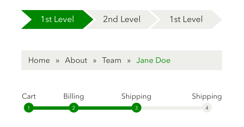
Source: Google - Implement breadcrumb navigation. It’s easy for users to get lost on e-commerce sites that boast enormous inventories. To help your shoppers more easily navigate your site and find items they want to purchase, use breadcrumb navigation. This element is perfect for sites with different category pages, as users can easily return to previous pages.

Source: https://www.dribbble.com - Optimize page-loading speed. Loading speeds are imperative to the success of an online shop. Users who are unhappy with page download speeds will bounce in a matter of seconds. Use analytic tools or hire a professional to check your pages’ download speeds for desktop and mobile. Make changes to optimize load speeds for better SEO.
- Dial down the sales pitches. Modern users are not interested in advertisements that shout at them over the radio or otherwise present an irritating interruption. 2017 is the first year Google started to penalize sites that use intrusive interstitials like pop-up ads and lightboxes. Google provides these examples:
2018 is looking bright for e-commerce merchants. Consumers are eager to online shop as an alternative to traditional shopping, and are doing so more and more often from their mobile devices. With the right website design and marketing strategies, online store owners can capitalize on the trend toward e-commerce shopping to increase their bottom lines. Use these UI/UX design tips to get your e-commerce site in shape for 2018 and beyond.

2 Responses to How to Prepare Your E-Commerce Site for 2018