
Google recently announced that mobile friendliness will be included within SEO rankings starting April 21. This news comes after a study reported that 2015 mobile searches will surpass traditional desktop searches. Although ad spending on desktop has dropped, mobile SEO spending has skyrocketed by 83%. With a growing number of users surfing the Internet from their mobile devices, Google has realized that it’s essential to provide better mobile user experiences by highlighting mobile-friendly websites.
It’s the first time that Google has ever announced an update before its launch – WHY?
First of all, websites that don’t feature a mobile-friendly design aren’t necessarily spam sites, pursuing some form of malpractice, or trying to manipulate Google’s search results for higher rankings. Another possible reason could be that many government (.gov), educational (.edu), and other authoritative websites aren’t mobile-friendly, but they’re extremely helpful for users and offer good user experiences on desktops.
For instance, Moz.com, which is a well-known website for all SEO experts, isn’t mobile-friendly as of April 9th. It’s plausible that Google doesn’t want these authoritative websites to lose their standing from the update and wants to give a heads up before taking these new actions. Although the percentage of websites that will be affected is unclear, Barry Schwartz is predicting that more than 14% of the World Wide Web will be impacted in real time.
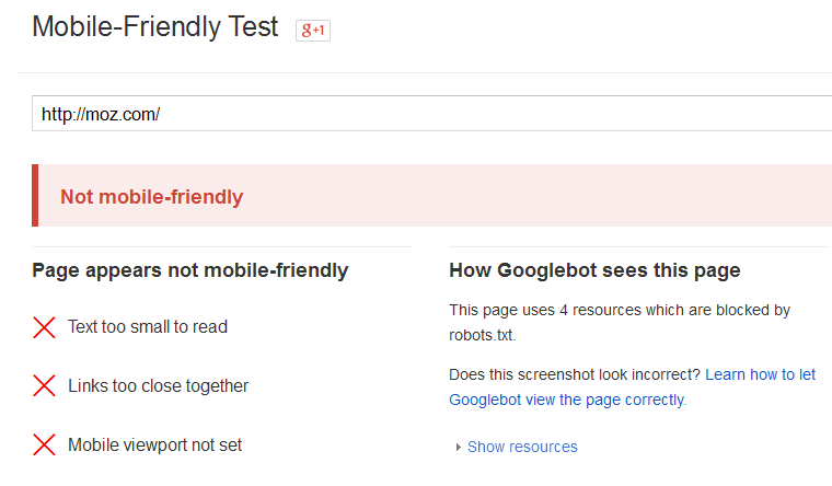
As per my understanding, websites that aren’t mobile-friendly won’t be penalized or be handed a drop in desktop rankings from this update. Instead, mobile-friendly websites will simply be featured more on Google’s mobile search results. [inlinetweet prefix=”” tweeter=”” suffix=””]Googlebot will favor sites that implement tactics that ensure a pleasurable mobile viewing experience.[/inlinetweet]
How to Make Your Site Mobile-Friendly
Now, the most important question is how you can employ mobile SEO techniques for keeping your website safe from this newest update. While there may be little to no penalties, I strongly advise that you take appropriate actions to stay on the safe side. Foremost, you’ll need to use a mobile-friendly design that can run properly on all devices. The three configurations include:
| Configuration | URL Structure | HTML code |
| Responsive Web Design | Same | Same |
| Dynamic Serving | Same | Different |
| Separate URL’s | Different | Different |
Responsive Web Design
As the simplest of design concepts, responsive web design uses the same URL and HTML for both mobile and desktop devices. In mobile devices, the HTML will automatically set its view port based on the visible area of the display. Responsive design is the configuration most recommended by Google because it saves resources when the Googlebot crawls the URL. Since there’s only a single URL, there’s less possibility for experiencing common mistakes that affect mobile websites too.
Dynamic Serving
Another configuration is dynamic serving, which uses the same URL but has a different HTML and CSS code in both desktop and mobile devices. Implementing this design can be quite tricky because it’s difficult to immediately change the setup that alters the CSS and HTML codes for mobile users. I recommend that you send a signal to mobile bots from the server for viewing mobile content, which will be hidden when desktop users crawl through the desktop version. You can send the signal to mobile user agents through the Vary HTTP header.
Separate URLs

Like the name suggests, separate URLs is a mobile-friendly website design that uses two different URLs for viewing in the mobile and desktop versions. For instance, a website would have www.example.com and m.example.com for their URLs. As long as you follow all search engine guidelines, this configuration will make the URL and your website’s content accessible from mobile devices. You will need to notify Google that you have a mobile-friendly site by using rel=”alternate” and rel=”canonical” though. Below is a helpful image for better understanding the use of these attributes.
Which Configuration Should I Opt For?
You’re probably now wondering which configuration will be best for your website. As previously mentioned,[inlinetweet prefix=”” tweeter=”” suffix=””] Google recommends responsive web design because it’s easy for users to remember one URL for both devices [/inlinetweet]and less resources will be consumed by Googlebot. On the flip side, Bing advises webmasters to use the one URL per content approach.
Another published article by Aleyda in State of Digital stated that responsive web design is an easy way to approach mobile SEO for websites delivering the same content to both devices. Use the following flowchart to help you determine which of the three configurations wins for you.
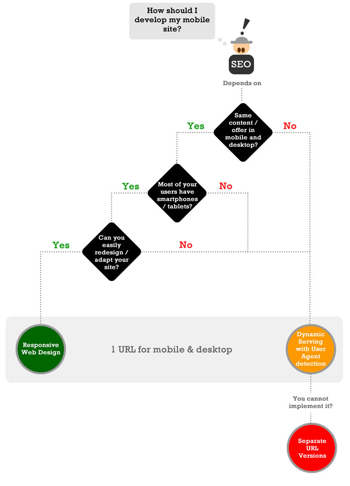
Every business has their unique art of engaging users, so how the content is delivered on their website will vary greatly from business to business. That’s why it’s important to note that opting for any configuration will also depend on the nature of your business. For example, if your mobile audience is using feature phones, then using separate URLs or dynamic serving would be a great fit. Remember that responsive web design increases load time, which is another SEO factor by Google. Just a one-second delay can reduce your website’s conversions by seven percent!
Adam Audette and George Michie of Rimm-Kauffman Group may have said it best in their classic post on marketing as applied science. “Mobile websites: Responsive design helps, but smartphone users have fundamentally different needs and only a site designed to meet those unique needs will produce the best outcome for the user and for the business.”
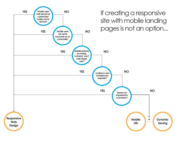
Bryson Meunier also revised the above decision tree with this flow chart to make choosing a configuration other than responsive web design more simple.
Avoiding Common Mobile SEO Mistakes
Once you select your website’s mobile configuration, you’ll also need to keep your business from falling into some of the most common traps to keep your mobile-friendly site functioning. Make sure your mobile visitors are always happy and your Google rankings are up by steering clear of these popular mistakes.
Don’t Block Java Script, CSS or image files
Above all, it’s highly recommended that you keep all files accessible to the Googlebot. Check out your website by using the “Fetch as Google” feature in the Google Webmaster tool.
Avoid Using Unplayable Content

No mobile users will be happy when they find a video that won’t play on their device. So, use HTML standards for animations to provide a good user experience. Make sure you’re utilizing video embedding to ensure smooth running on all mobile devices.
Use Mobile Only 404
If one of your website’s pages doesn’t exist in a mobile version, then you should create a custom 400 error page or simply show the desktop version. Avoid redirecting your mobile visitors back to the homepage to curb any aggravation.
Follow Page Speed Guidelines
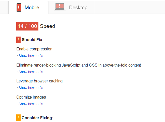
In our fast-paced digital world, mobile users want to view your website’s content fast. Make certain that your mobile-friendly website is following all page speed guidelines. It’s advised that you keep your mobile site’s page speed above 85/100 for lightning fast loading times.
Optimize Titles and Meta Descriptions
Mobile devices have much smaller screens than desktops and laptops. Therefore, it’s essential that you optimize your titles with 50 characters and your meta description with 90 characters maximum to provide useful information to users on SERP regardless of their device’s size.
Fix Faculty Redirects and Cross Links
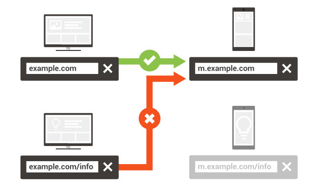
It’s unfortunately common for mobile websites to have a larger number of faculty redirects, crawl errors, and cross links. Use the Google Webmaster tool to easily locate these and fix the errors before mobile visitors are turned off. Make sure the server is redirecting to an equivalent URL on mobile devices.
Use Semantic Markup
Don’t forget to use semantic markup in building a mobile-friendly website that both you, your website visitors and Google will enjoy. On such small screens, it’s essential that you display results with rich snippets of information to receive more clicks.
Include a Mobile Sitemap
If you’re using separate URLs for a mobile viewing version, create a mobile sitemap and submit it to Google. This will allow the search engine to better serve search requests from mobile devices and lead them towards your website’s pages.
Avoid App Download Interstitials
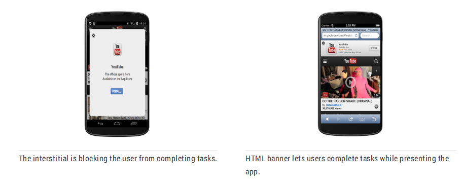
Many webmasters decide to promote their business’ apps to mobile users, but this can cause a poor viewing experience if used improperly with app download interstitials. It’s advised that you use a simple banner for promoting your app while still presenting the page’s mobile content. You could use Smart App Banners for Safari to help implement this mobile SEO strategy.
Final Words
It’s clear that mobile SEO is the future and won’t be going away anytime soon. Internet users want to view content quickly and efficiently on their mobile devices on-the-go. Finding your targeted audience and making your website mobile-friendly with the right configuration is currently the best SEO approach for 2015.
So, which configuration are you going to use now and why? Tell us below in the comment section!
 About the guest blogger: Shane Barker is a digital marketing consultant, named the #1 social media consultant in the nation by PROskore Power Rankings. He has expertise in business development, online marketing and is an SEO specialist who has consulted with Fortune 500 companies, government agencies, and a number of A-list celebrities.
Social Media Profiles
Twitter: https://twitter.com/shane_barker
Facebook: https://www.facebook.com/shane.barker.14
Google+: https://plus.google.com/+ShaneBarker1
Instagram: https://instagram.com/shanebarker

One Response to Google Mobile Friendly Update – What to Do Now?