“You’ve got a new subscriber!”
As a marketer, there is no better feeling than having a visitor sign-up for your newsletter or service.
After all, in a world where email still offers the highest ROI of all digital channels, getting subscribers can mean the difference between marketing success or failure.
But while getting a new subscriber is great, there is still a chance that your subscriber might abandon your site if you are unable to make a good first impression.
One way to ensure they stick around is by creating a stellar welcome email.
Welcome emails help you to “strike while the iron is hot” and create a lasting relationship with each subscriber. The first email you send will often set the tone, brand value and future expectations for your subscribers.
Here are several ways to ensure your welcome emails effectively fulfill those goals.
1. Send Welcome Emails Immediately
Don’t delay in sending out your welcome email. Ideally, you should send them out on the same day of signup (preferably instantly with the help of email automation software).
Why?
When a user signs up for your service, they are engaged with your brand and interested in having a conversation. The longer you delay, the more difficult it becomes to continue the conversation as users begin to lose interest.
Take a look at the result of this study which shows how long marketers wait before sending a welcome email post signup.
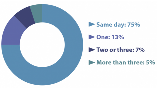
This ties into data from InsideSales which found that contacting subscribers within 5 minutes of signing up increases the chance of conversion 21 times.
The takeaway: Send new subscribers a welcome email as quickly as possible.
2. Have a Clear and Engaging Subject Line
Welcome emails are most effective when they are easily identified in the user’s inbox. To achieve this, many services use the word “Welcome” directly in the subject line.
Take a look at this very matter-of-fact welcome email from MailChimp:
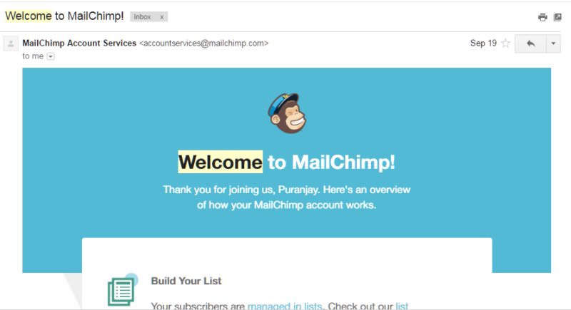
While being direct certainly works, it’s also a good idea to experiment and add a spark of interest to grab attention. Take a look at this assortment of welcome email subject lines:
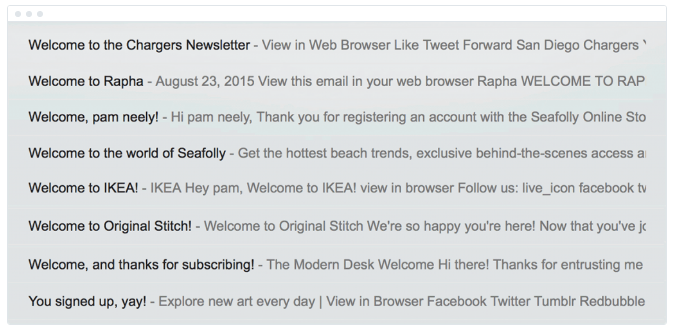
These range from the direct – “Welcome to Rapha” – to personalized (“Welcome, pam neely!”) to casual emails (“You signed up, yay!”).
The kind of copy you choose will set the tone for your brand. “You signed up, yay!” is casual while “Welcome to Rapha” is straightforward.
3. Include a personalized greeting
While designing your opt-in form, you probably kept the number of fields to a minimum in the hope of capturing more information later. However, if you do have additional fields such as name or location, put that information to use immediately.
For example, if you have user’s name, create a personalized greeting, like this:

Or if you have their location, inform them where they can find your nearest physical store or local offers. For example, Uber knows my location, so it sends me an email with new developments for my city:
![]()
Check out this welcome mail from Freemans:
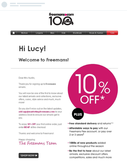
Notice how the email greets the user by her name.
To take personalization a step further, make sure you don’t use a ‘no-reply’ email address to send your welcome email. Instead, give your email a human touch by having it come from an actual employee of your company with a real email address. Check out this example from Groove:

Such level of personalization strengthens the relationship and builds trust with your users.
4. Generate value for users immediately
The quickest way to drive away your new subscribers is by sending them a welcome email that just confirms their subscription. Avoid this by generating value for subscribers immediately.
To do this, offer your new subscribers something right off the bat that will help you win them over. For example, you might link out to your previous newsletters to provide subscribers with greater insight of your product.
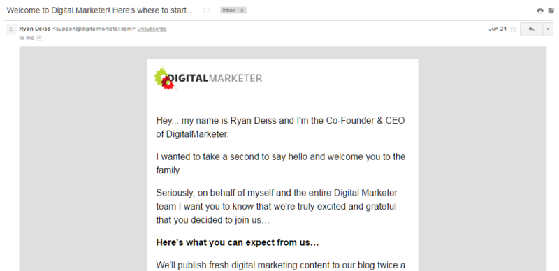
Ryan Deiss of DigitalMarketer personally introduces himself to each new subscriber:
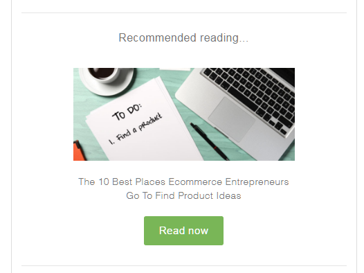
Shopify links out to an article on its “recommended reading” list:
If you incentivized signup through offers such as discounts, make sure to deliver on that promise in your welcome email. Banana Republic does that in their welcome email:

By offering free standard shipping for new subscribers, not only is Banana Republic providing value to subscribers but incentivizing them to take action.
5. Make the email visually pleasing
If you don’t include any images in your welcome email, chances are it won’t be as effective. In fact, according to a study, 86% of respondents voiced their desire for interactive and visual content before making a decision. Therefore, make sure your welcome email includes a healthy balance of text and pictures.
Here’s an example from Crocs:
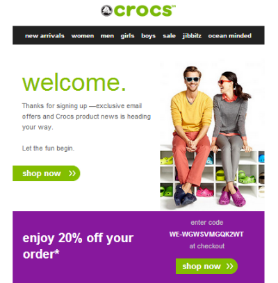
See how they include an image of happy customers using their product?
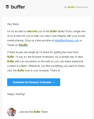
Even if you don’t include strong visuals, make sure that your welcome email has a clean, visually pleasing layout. For instance, Buffer’s welcome email features a simple one-column layout with the Buffer logo and the founder’s picture.
6. Include a single CTA
Every welcome email should include a single CTA urging users to take action. For example, if you are an eCommerce store you might include a “shop now” button. If you are a SaaS service you might urge users to “complete their profile.”
Take a look at Kate Spade’s welcome email:
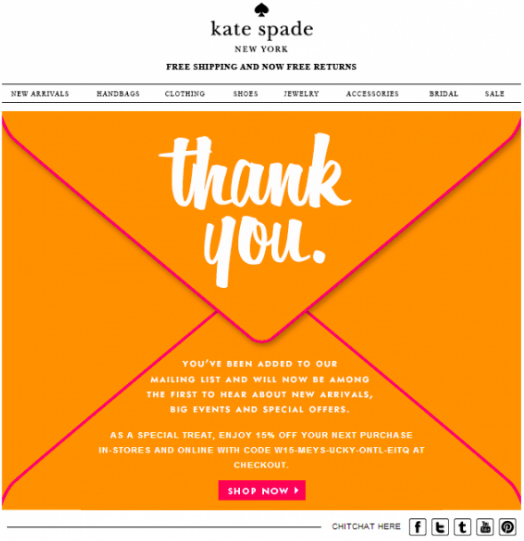
Notice how your attention is immediately drawn to the CTA? By using a color to set it apart and including the actionable copy, Kate Spade is driving its new subscribers straight to their store.
Here’s another example from Tictail:
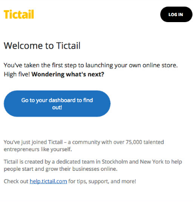
Similar to Kate Spade, the CTA stands out by being a different color than the rest of the content. However, while Kate Spade uses actionable copy (“Shop Now”), TicTail’s copy is curiosity-generating (“Go to Your Dashboard to Find Out”).
It’s important to not to use too many CTAs in the email — that will just confuse the reader. At most, you should include two CTAs — one at the top of the email, one at the bottom.
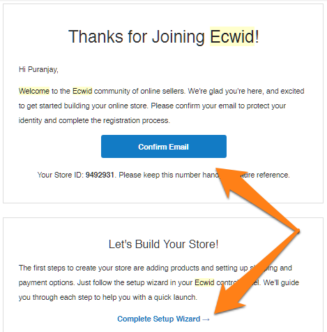
If you are going to include multiple CTAs, make sure that your primary CTA is more prominent than the secondary CTA. For example, in Ecwid’s welcome email, the primary CTA is a button while the secondary CTA is a text link:
7. Onboard your subscribers
After signing up, 25% of subscribers fail to engage with a service because they are not onboarded correctly.
For this reason, it is important to begin onboarding immediately by including tips in your welcome email. Use lists, bullets, or visual content to provide clear instructions on how users can begin to use your product or service.
Take a look at Quora’s welcome mail:
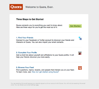
The welcome email maps exactly what the user needs to achieve to get started using their service in a simple yet appealing manner.
Over to You
Your welcome email is one of the most important messages you will send out.
If done right, you can make a lasting impression of your brand. What you say — and how you say it — in this email will affect your business in the long-term.
Make sure that this email is clear, personalized, and has your brand’s voice. Follow the seven guidelines above to get started.
Which of these welcome email guidelines do you follow in your own emails? Share it in the comments below!

 “Welcome emails help you to ‘strike while the iron is hot’ and create a lasting relationship with each subscriber.” — Puranjay Singh