We all know (or should) that website content needs to provide value and be authoritative. We also know that optimizing it for search engines is important. But one area that is often overlooked is writing and formatting it in a way that matches the way people read on the internet.
Think about it. How do you feel when you encounter a webpage with long, dense paragraphs, nothing but a sea of black and white?
In general, people don’t read online content. They scan it, looking for the information they want or need. Therefore, it’s important to make your content scannable.
There are several ways to do this. Let’s take a look at some of them.
1. Use short sentences and short paragraphs
We’ve all had those moments where our eyes have glazed over in the middle of a paragraph or even during an unexplicably long sentence. Don’t do that to your readers.
Look for opportunities to break long sentences into two or more. And don’t let paragraphs go more than 4 lines.
In fact, paragraphs can sometimes be just one sentence.
Seriously.
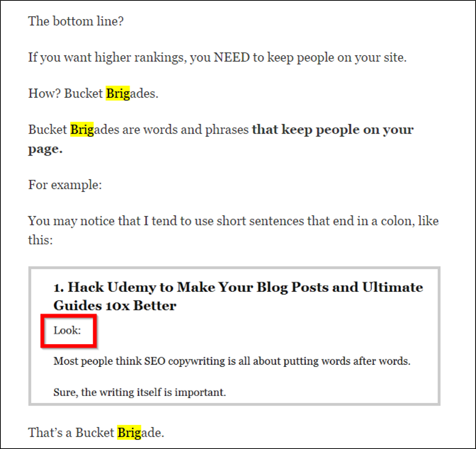
Backlinko takes this almost to the extreme. Most of their copy broken up into single-sentence paragraphs. They also utilize something they call “Bucket Brigades,” short words and phrases that grab attention, followed by a colon:

Backlinko’s technique may seem to be a bit much. But the proof is in the pudding. Their site’s average time on page is more than four minutes.
Breaking up content into shorter sentences and paragraphs automatically adds white (blank) space that just automically makes the content look easier to read. Because it is.
2. Use Headings and Subheadings
Ain’t nobody got time to read 1,000 words. Headings and subheadings help readers decipher what type of information is in each section so they can decide which areas are worth their precious time. Plus, they break up the content, adding more of that crtical white space.
Not only that, it is believed that headings have at least a minor impact on search engines rankings. To get the most out of them from a search perspective, use your keywords in your headings and subheadings when appropriate.
3. Use Bulleted and Numbered lists
Lists take scanning to another level. If you have a series of points, put them into bulleted or numbered lists instead of in a paragraph to make it easy for visitors to scan through the points. If you can find away to make your bullets and/or numbering a little unique, all the better.
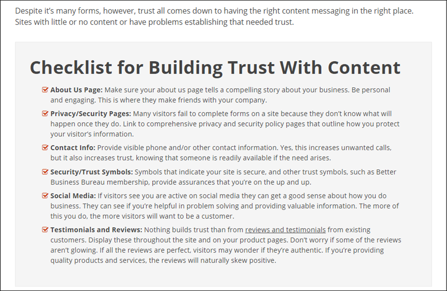
On the Pole Position Marketing E-Marketing blog, we started including a bulleted list of action items at the end of most posts. This helps summarize the points of the post and ensures that readers walk away with actionable tips.
Rather than using standard bullets, we use checkmarks:

Bulleted and numbered lists also can be helpful for your search engine presence. It MAY provide a positive signal to Google for ranking purposes. It can also help your content get put in a featured snippet.
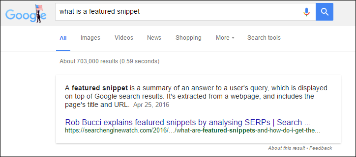
If you are not familar with featured snippets, they are the boxes that appear before all of the other search results in a Google search. The snippet takes information from a web page to answer the searcher’s query. For instance, if you type “what is a featured snippet” into a Google search, you get this:

Formatting your content into a list (ordered or unordered) can help you get this coveted spot, which is often referred to as “Position 0” since it appears before the #1 ranked results.
4. Break Out Quotes and Important Information
Is there a point you really want to drive home? Or maybe you wrote something in a particularly unqiue way. Draw those out with call out boxes or images to help readers who are scanning see this important information. It also just makes your post look better.
You can even add a Click to Tweet link to these pull outs to make them easy to share. Here’s an example:
5. Use Images Early and Often
This is probably the most important tip on the list. If you aren’t including at least one main image on every single blog post, you need to start. NOW!
Take it to the next level by adding the post title on the image. Social networks are becoming increasingly more visual. Adding a main image with the blog title can help you get more engagement on those networks. And with visual platforms, such as Pinterest, it’s a necessity.
One main image may be enough if you have a rather short article, but if you have more than, say, 500 words, you probably want to add some more images. Having one at each scroll depth is recommended so there is always an image on the screen as visitors read through your content.
Don’t depend too heavily on stock photography, which tends to feel unnatural and doesn’t add a ton of value. Screenshots, snapshots, and illustrations can all be great options. Ask yourself if some of the information could be put into an infographic.
I like using gifs, too, to add a little humor, in additional to visual appeal to my posts.
via GIPHY
One Final Tip
Not sure if your content is scannable enough? One thing I like to do when previewing my posts is zoom out so that I can see how dense the text looks. Is there enough white space? Should I sprinkle in a few more images? This is a quick way to tell if your content is easy to read…or not.
So how about you? What tips do you have for making content more scannable?

 “Is there a point you really want to drive home? Or maybe you wrote something in a particularly unqiue way. Draw those out with call out boxes or images… — Julie Graff”