 Even though mobile marketing is becoming increasingly important, it’s still common for web designers to forget to produce mobile specific wireframes and comps for an in-progress website. That either means that they do not yet take mobile design seriously or they think a WordPress plugin is a real solution to making a mobile-friendly site.
That mindset is kind of like competing for second place.
[inlinetweet prefix=”” tweeter=”” suffix=”@StoneyD”]The primary difference between mobile and desktop design is accounting for the differences in screen size. [/inlinetweet]For the most part, mobile and desktop sites can work off the same overall design, but there are two primary differences that need to be accounted for:
Navigation
Desktop: [inlinetweet prefix=”” tweeter=”” suffix=””]On desktop screens, your primary navigation should always be visible.[/inlinetweet] Visitors should be able to quickly scan the navigation to get an overall sense of what you offer and where to go to find the information they want. Hiding navigation on a desktop screen forces visitors to hunt and click rather than scan and learn. This is a complicating layer in the visitor’s on-site experience.
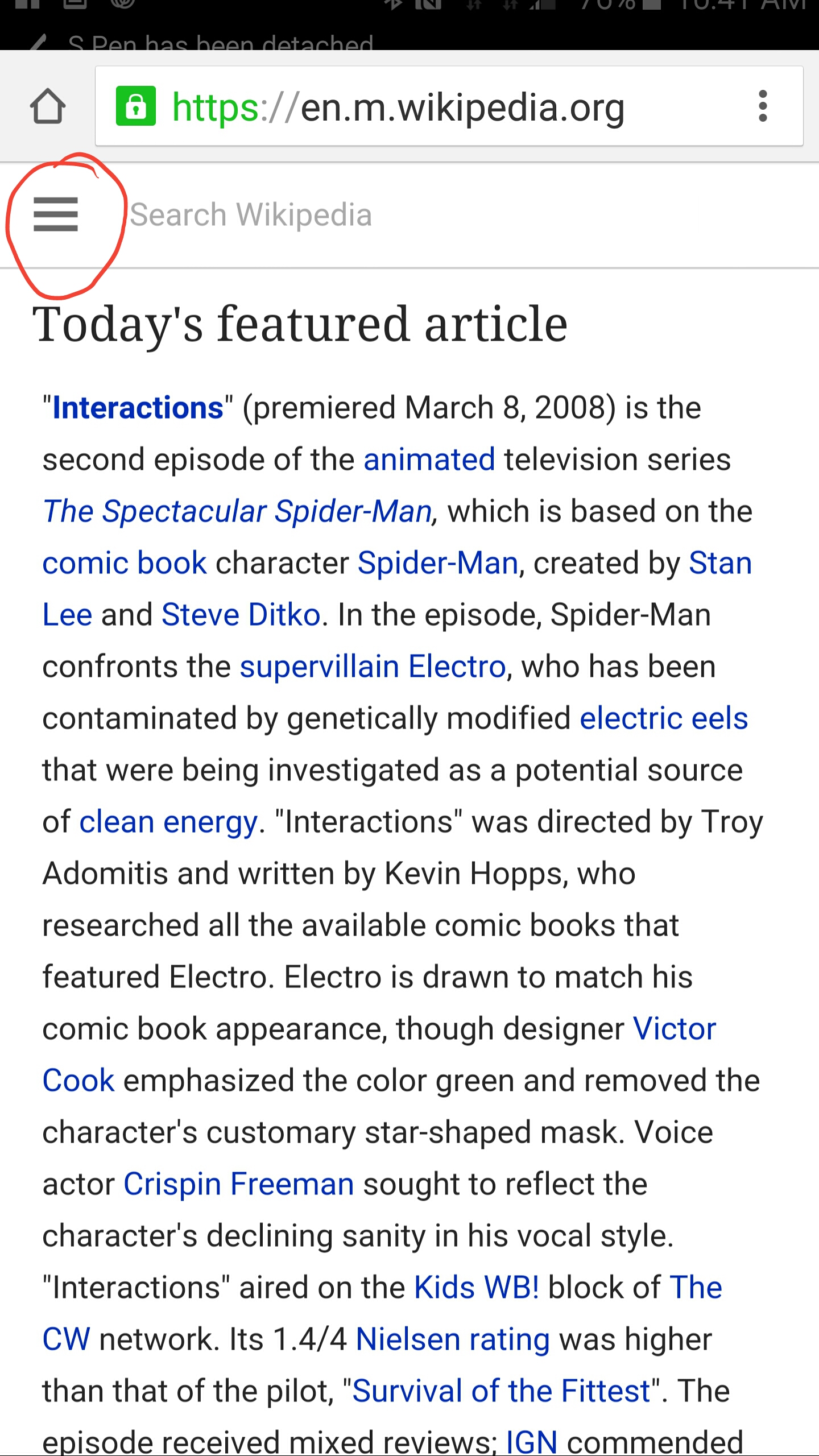
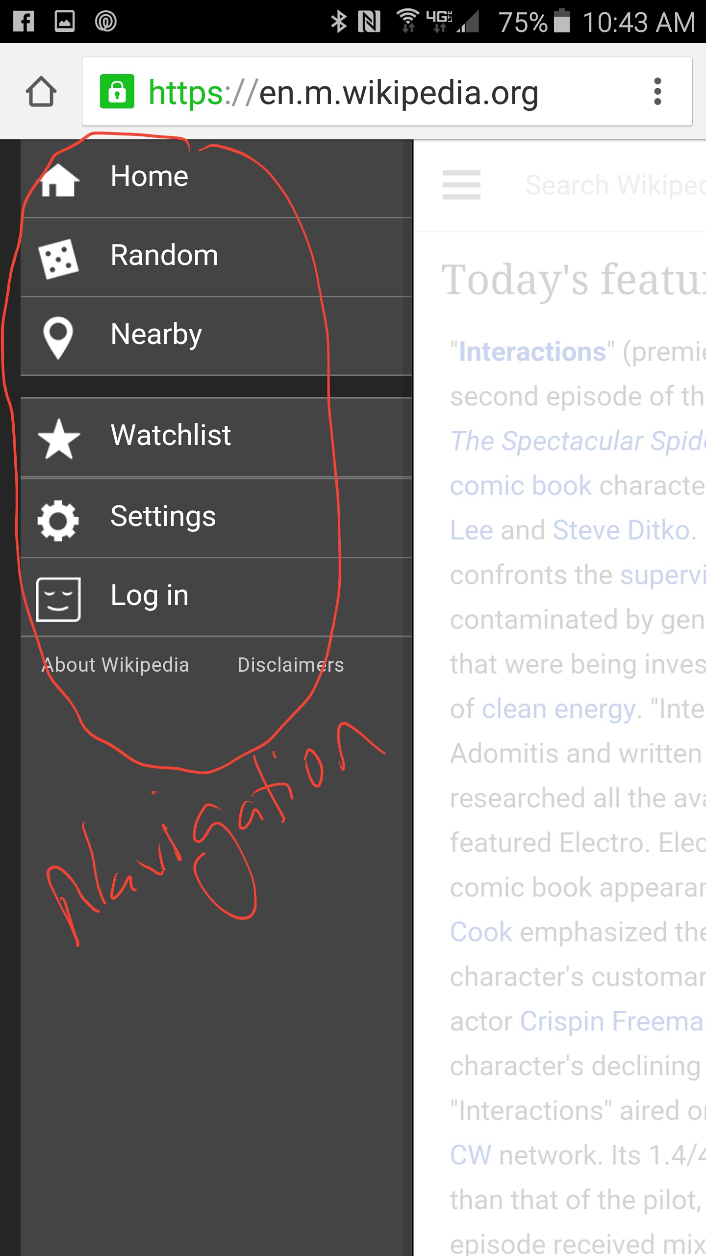
Mobile: With the limited screen size, primary navigation on mobile devices needs to be on-demand rather than always visible. Always-on navigation pushes the most valuable content too far down the page and requires a lot of scrolling up and down in order to navigate from page to page. By making navigation available on demand, you’re giving the visitor control of their content consumption, and allowing for a less cluttered mobile page.


Content Accessibility
Desktop: With larger screens, more information can easily be displayed to the visitor. Where on mobile devices, you want on-demand content, on desktop devices you want always-on content. Though some on-demand content can be used to enhance the visitor’s desktop experience, for the most part, hiding content adds unnecessary steps. On desktops, it’s easier to visually segment out specific sections of content for skimming and scanability. There is simply more space to work with!
Mobile: Here using on-demand mobile display becomes essential. While using a mouse to scroll on a desktop screen isn’t a big deal, repeatedly swiping up and down the screen poses problems. For that reason mobile design needs to take advantage of content chunking, making specific sections of content available only on demand. This gives you better control over how visitors see your calls to action and allows them to read the most valuable content while skipping that which is of less value to them.
Overall, the lines in content accessibility are blurring and I advocate to making the desktop experience more in line with the mobile one. But that only goes to how content is displayed, not the navigation or other areas of the site. The goal is to give the visitors the best experience for the device they are on. Paying attention to the differences between mobile and desktop helps you build a better site experience regardless to how your site is being viewed.
