Over the past few years, there has been a growing trend for websites to turn their navigation into a complete sitemap, presenting as many options to their visitors as humanly possible. The thinking behind this is to make it easy for visitors to quickly get to where they need. You know, the 3-click rule?
Unfortunately, this is faulty thinking. While the 3-click rule applies (visitors should be able to reach just about any page within 3 clicks from the home page), it is by no means a trump all to good usability.
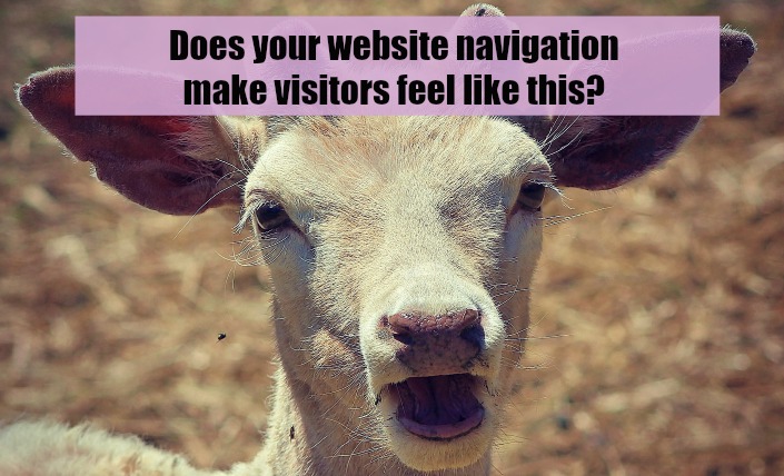
[inlinetweet prefix=”” tweeter=”” suffix=””]Studies have proven that too many options actually reduces the number of visitors selecting any option at all.[/inlinetweet] Basically, people get the deer-in-the-headlights effect.
People simply don’t know how to digest that much information and essentially become paralyzed into making no decision at all. This happens to me in the real world. I’ve been to Vegas many times and have always wanted to go see a comedy show. I’d see advertisements and billboards for all kinds of acts, but I was never able to make a decision. So what happened? I went to none at all.
Actually, I did go see Penn and Teller one time but only because I had already planned on seeing them before I ever got to Vegas. But this makes a good point. If people don’t already know what they want before coming to your site, fewer options, not more, help them get to the information they want.
When too many options are presented, visitors typically will just click on one of the first few links available, hoping it’s what they need. If not, guess what? They split.
[inlinetweet prefix=”” tweeter=”” suffix=””]Keep your navigation tidy. Reduce the number of options and use those to filter visitors to what they came for. [/inlinetweet] If visitors have to hunt for information, it’s better to make them hunt by clicking one category level at a time than hunt by trying to find where to click in the first place.

