 This is part of the Total Usability Series that was originally published in 2007. A decade later, usability is more important than ever, so we are revisiting this series and updating all of the articles. This post was updated 10/11/2017.
Not every site needs, nor should have, an on-site search feature. But those that do must be sure that the search isn’t just an after-thought.
Don’t add it just because you think visitors want it. Adding a search function is not necessarily good for on-site usability. Implementing a search function improperly is often a greater source of frustration than not having one altogether.
For this reason, your on-site search function should not be taken lightly. In fact, it’s better to not have a search option than to have one that potentially gives the searcher a “false impression” as to the availability of products/information on your website. Much time and consideration (and development) needs to go into the search option to ensure that it not only returns accurate results but that it’s fully comprehensive in interpreting the searchers’ intentions.
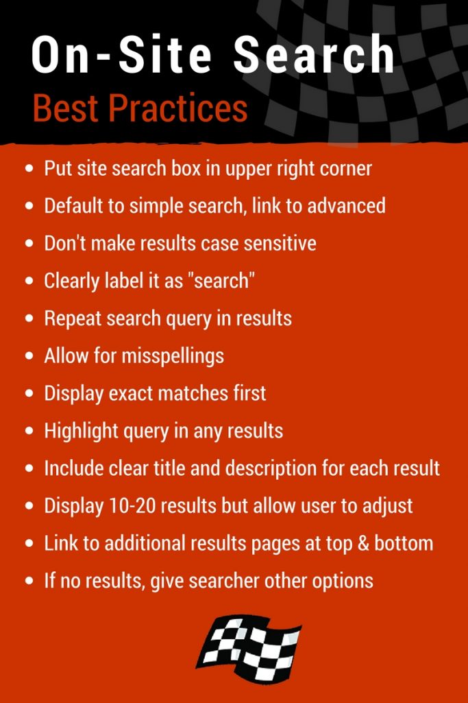
If you do decide that your site needs an internal site search, keep these factors in mind:

Location
Website search boxes are most often located in the top right corner of the website. This creates an expectation from shoppers, so make things easy for them and place your search box where they expect to find it.

Search options
The search box should default to a “simple” search. If warranted, provide a link to “advanced” options that allow visitors to fine-tune their search helping them find what they want more quickly.
Case sensitivity
The basic or “simple” search should not be case sensitive. If case sensitivity is an issue, this option should be made available through the advanced search option.
Search labels
The search box and/or button should be clearly labeled. Using words such as “go” or “start” are not inherently obvious for search. The word “search” should absolutely be used on or near the search box.

Search query
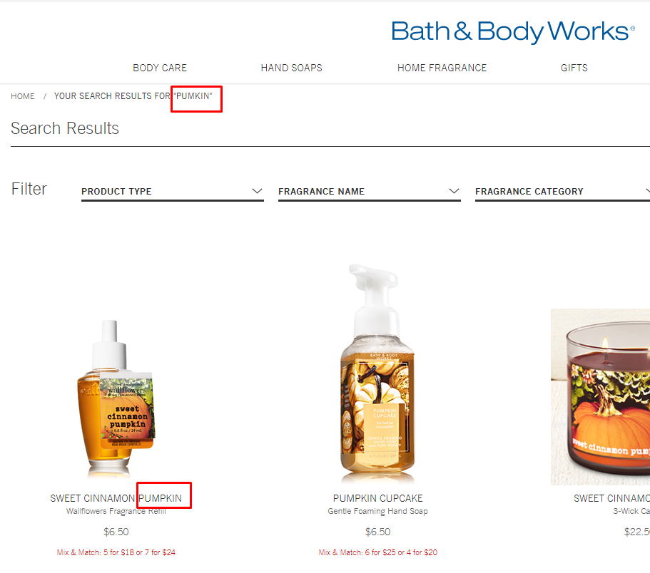
The original search query should be presented on the results page, both in the search box and as a headline above the search results. This ensures the visitor knows what exactly was searched and allows them to refine it without having to retype the entire query.

Misspellings
The search feature must be intuitive enough to recognize all possible common misspellings. Searchers who mistype their search and don’t realize it will otherwise be told their product is unavailable on your site, causing them to leave for another site.

Result matches
Results should display exact matches first, with close matches second. This provides visitors with enough information that a second search may not be necessary. Get them what they want sooner, rather than later.
Result highlights
It’s beneficial to highlight (or bold) the words on the results page that were used in the query. Even better if you can continue the highlighting of search words as the visitor clicks through a link into the content page.

Titles and descriptions
Each result should display a clear title and description. This information should be pulled from page titles and meta descriptions or on-page content.

Number of results
Results page should display 10-20 search results at the most. However, it’s nice to add an option to increase/decrease the number of results per page.
Number of result pages
Links to additional search result pages should be provided as necessary and located at both the top and bottom of the page.
Zero results found
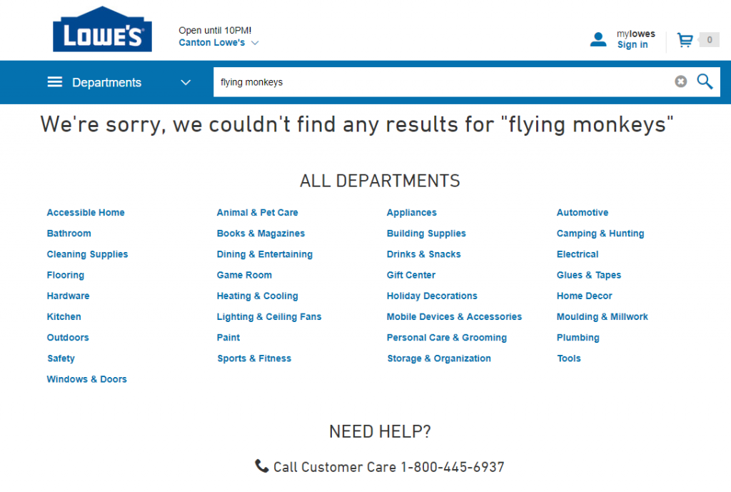
If no results are found, you must provide clear messages to visitors suggesting alternative searches, refinement options, and links to important areas of the website. You should never leave them with “no results found.”

Internal site search can be a great resource for your visitors, helping them get to the information they may not otherwise be able to find. Make sure your site search enhances the user experience by using the tips above.

One Response to Searching for Better On-Site Search Usability