The secret is out. The “internet” thing is kind of a big deal.
The last few years have been the gold rush of our generation. Everyone’s moving their businesses online in hopes to tap into a global market.
This rush has created a tremendously competitive space on the web.
I’ve built, scaled and sold a number successful ecommerce websites. Here are a few tips I’ve learned along the way.
1. Create value, not just products
If you take anything away from this article, this is it:
[inlinetweet prefix=”” tweeter=”” suffix=”@ryanwashere”]The best way to stand out in a crowded space is to create something uniquely valuable to your audience[/inlinetweet]. That’s where content comes into play.
A great place to start is with your product descriptions (yes, this is a form of content). Traditional product descriptions are boring. Think outside the box.
This watch vendor added an interactive element that allows visitors to highlight a piece of the watch to read more about it. This little piece of interactivity keeps visitors engaged, entertained and interested in the product. If you don’t have a top notch creative team in house, there are a number of other simple things to do as well:
- Add videos
- Add additional high resolution images
- Show your product being used in real life situations
Beyond product descriptions, there are many ways you can add content to your site. Get creative and think beyond traditional content. Video is a great way to draw in visitors and paying customers to your ecommerce website. Consider producing how-to videos to show people how to use what you sell in your store. Basically, you’re giving something away for free, but at the same time, you’re taking advantage of the chance to sell something.
Another easy way to add content to your store is with your Frequently Asked Questions section. Regardless of what you sell, you probably have to deal with common questions. FAQ pages help you to rank in search engines as well as help with customer support. You can kill two birds with one stone.
2. Speed up your website’s load time
Have you noticed some visitors leave your store after only a few seconds? If so, there’s a good chance your website loads too slow. Today’s consumers won’t wait around for sites to load.
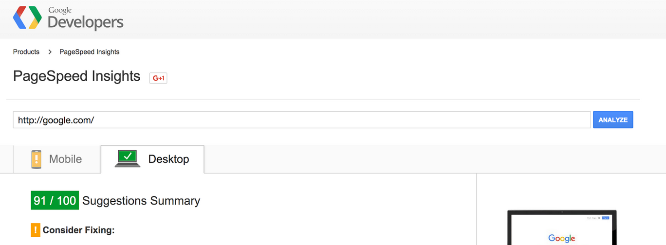
Slow load time will also affect your organic rankings. Google’s been vocal about the importance of a fast loading website. Therefore, it’s vital you have a fast-loading website. Start by using Google’s free tool to test load times.
After you gather the insights, there’s some simple changes you can make to dramatically increase load times:
- Download your images and use a compression tool to make them smaller
- Upgrade your web hosting to a VPS
- Monitor and fix your server uptime (I strongly recommend Shopify)
Improvements as small as one second can have a dramatic impact on conversions.
3. Put time into improving your checkout process
You know the scenario: A customer puts items in the cart but never completes the purchase.
It’s a common problem that is generally attributed to a clunky checkout process. If you make your customers jump through too many hoops to check out, they may just leave.
Here’s some quick hits you can implement right away:
- Add “checkout” buttons to the top and bottom of the page
- Make sure your call to action (checkout) buttons are highlighted in completely different colors
- Include payment option icons on the checkout page. If you don’t accept multiple forms of payment, you need to start!
- Include links to a FAQ or privacy policy statement
- Make the checkout process visual (see below) for users to understand where they are in the process
Look into solutions that will shorten the checkout process. In turn, your revenues will soar.
4. Remove clutter and needless information
Not only do people hate clutter, it pulls attention away from what really matters . . . the conversion!
I see a lot of sites that try to jam side bars, pop ups and other call to actions on the their pages — for what? When a visitor reaches your product page, why would you want to drive them anywhere else?
Nike is a great example of simple, clean and easy- to-use product pages that keep traffic on the page and funneled towards conversion.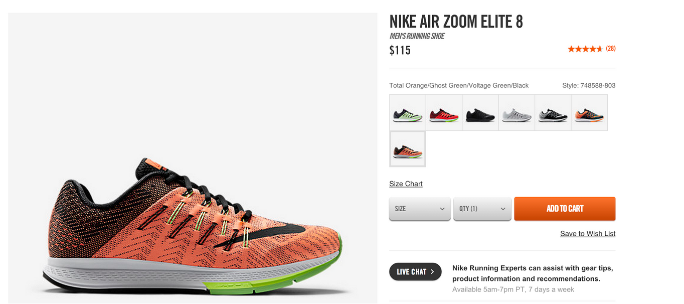
Once you’ve successfully driven them down the funnel, don’t give them a chance to escape!
5. Add ‘similar product’ boxes
Upsell, upsell, upsell.
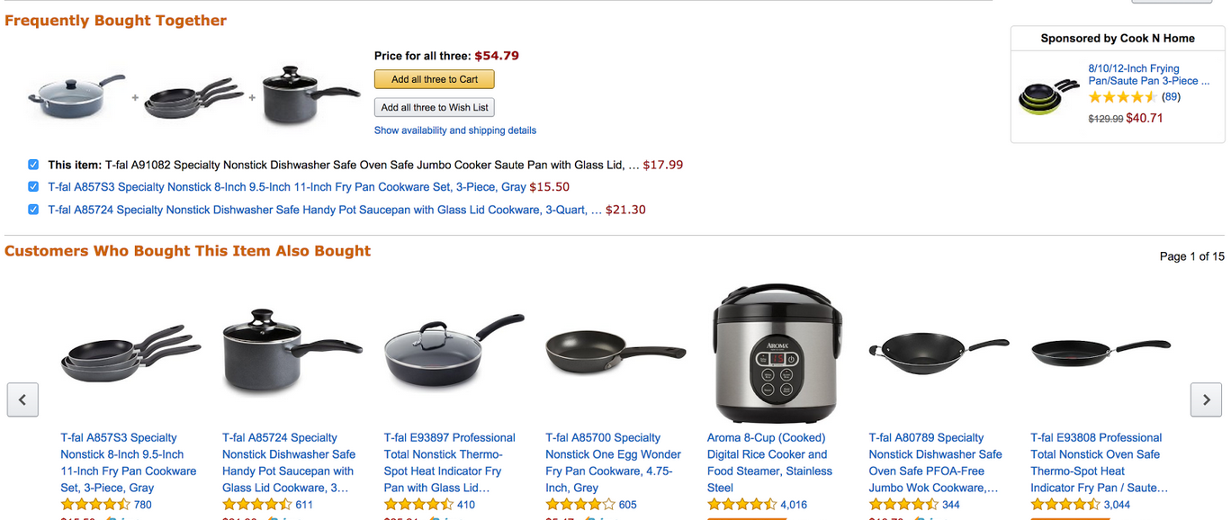
Adding similar products or bundles is a great way to capture additional sales from a prospect or help them find a similar product they might be interested in. To find a great example of the upsell/ cross sell, just look at the king of ecommerce — Amazon.
Granted, they have the most intelligent ecommerce engine on the planet, but there are a number of simple plugins and lines of code you can implement for a similar effect.
6. Let your visitors contact you
I do a lot of consulting for ecommerce stores and online entrepreneurs, and I’m always shocked at how few have a clear call to action for contact info. A lot of ecommerce store owners are under the impression that because the store is online, people want to be left alone to shop in peace. It’s actually the complete opposite — because things are so ambiguous on the web, people seek out customer service for answers.
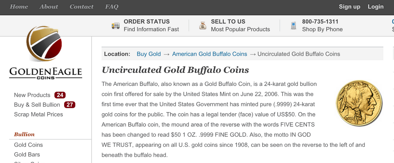
Golden Eagle Coins is a perfect example. By simply adding an 800 number to the top of their website, they were able to increase conversions by 74% within the first week.
If your customers can’t reach you, they’ll reach your competitors instead.
7. Remove forced logins to checkout
This is by far my biggest pet peeve with online shopping. You’re already taking my money. Why the hell do you need me to create an account and login?! Stop making people create an account to purchase a pair of socks — it’s incredibly annoying and I personally refuse to shop at stores that do.
Removing forced logins at the checkout and instead allowing customers to checkout as a guest is an easy way to prevent lost sales. At the same time, you can increase your revenues.
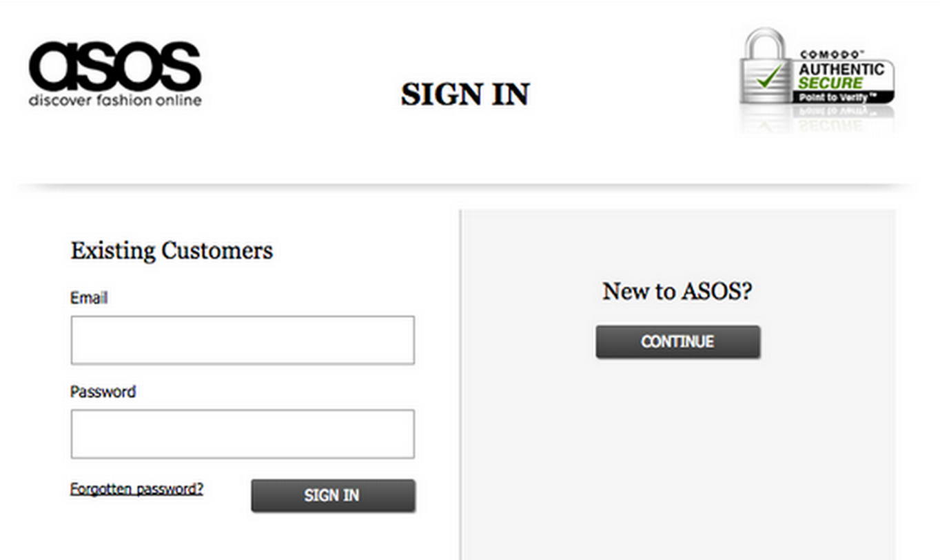
With that being said, there are some stores where I can understand the need to create an account. If you fall into that category, take notes from Asos. They improved their shopping cart abandonment rate by 50% by simply updating their UI and changing around a few words.
Before:
After:
Notice the difference? It’s subtle. They took out the “create an account” call to action and switched it with “continue.” Subtle changes like this can go a very long way.
You Can Do It
Running an ecommerce website on today’s web is extremely difficult, and I only foresee it getting tougher as bigger brands invest more online. But by following these tips, you can compete with the big guys and get more revenue out of your ecommerce store.
 Ryan Stewart is a digital marketing consultant based out of Miami FL and Boston MA. With over 8 years of client facing experience, Ryan specializes in increasing organic traffic through content, link building, outreach and social media promotions. You can follow Ryan on Twitter @ryanwashere.

