Not long ago I had one of those “ah-ha” moments. We were quoting a web development project, which included a lot of content needing to be written or updated. Typically, we would go through the process of designing and coding the website while the content is being developed. Once completed, we would then port the finished content into the design templates.
But my developer got me thinking that maybe this was the wrong approach!
One of the things we stress as a web marketing company is that every page of a site must have apurpose. Yes, we want the visitor to get the information they came for, but what’s next? This question needs to be answered, and the content must provide a clear path for the visitor to follow in order to get them to take the next steps of the conversion process. The site design doesn’t drive the goals. Instead, it must assist the message in order to get visitors to achieve the goals.
Content Comes First
It’s hard for the design of any given page to help fulfill the goal of a page if the goal isn’t known until after the design is completed. Which means in a web design project, the content must come first. It comes before the coding, before the design and before the wire frames. Why? Because the design will be molded around the content of the message.
The message of the site is more than just text. It’s images. It’s placement. It’s calls to action and a whole host of other things that will be impacted by the design. If you don’t know the message, you can’t design for maximum impact of that message.
But once you have the message, that makes the design easier. You’re no longer just creating a neat design, you’re designing for a purpose!
Templates Still Work, Only To A Point
Many pages of a site can have content fit into a template. In fact, it would be foolish to try to create a custom design for every page. For instance, all blog posts should fit a similar template. One basic blog post design will work for all posts. Product pages will likely have the same solution. The goals of those pages are to get visitors to buy the products, and a consistent product template can help facilitate that.
But some pages absolutely need their own design because the message and goals of those pages are unique.
Home Page: [inlinetweet prefix=”” tweeter=”” suffix=”@Stoneyd”]Never design the home page before you know what the content will be.[/inlinetweet] This is the page will benefit most from designing around the content. Get the message first, and use that to create a compelling design that entices the visitor to click further into the site.
About / Contact Us Pages: These pages both have atypical site content, and the design of these pages should definitely be molded around the information you are providing. These are great pages to break out of the mold and be created in your visual approach while enhancing the message and facilitating the visitor on to better goals.
Product vs. Category vs. Content Pages: One template can work for each of these page types, but it’s definitely not ideal. Each of type serves a unique purpose, and the design must bow to the will of the message in each case.
Various and Sundry: Every now and then, you’ll have a “typical” page with an atypical message. Be willing to break the template mold and add some unique design elements to any page that requires it. It might be a page that requires a form or unique imaging, or maybe it has some additional information that should stand out from the rest. Make sure your designs accommodate this visually so the important information doesn’t get lost in the monotony of the templates.
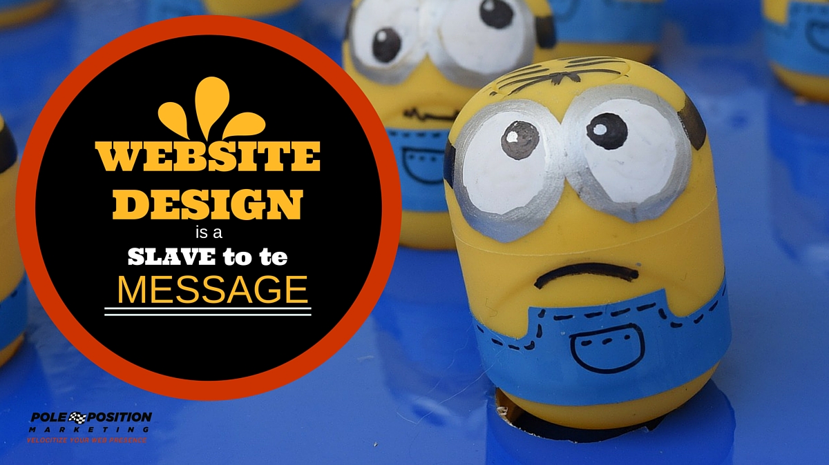
When you design first, your force the message to be a slave to the design. This is all wrong and puts the focus in the wrong place. The design should not be the driver of the goals, it’s only there to assist.[inlinetweet prefix=”null” tweeter=”null” suffix=”@Stoneyd”]Build your content around your message and let your design support that message[/inlinetweet] so more visitors will achieve the goals they came for.

2 Responses to Website Design Is a Slave to the Message